WordPress 4.1: Whats it Got?
WordPress v4.1 was released with two members of the WooTeam Hugh Lashbrooke and Mike Jolley being part of the group of 275 contributors to this release. Much was said about WordPress 4.1, particularly with regards to the apparent milestone version that the number seems to indicate. What is included in the release and see just what difference it makes to our daily lives.
What’s included WordPress 4.1?
Every WordPress release comes with a plethora of features, improvements, fixes and general updates. This release was no exception and in v4.0 there were 711 tickets that were included – each ticket represents either a new feature, an enhancement on an existing feature, or a fix for a broken feature.
These are the main new features included in WordPress 4.1:
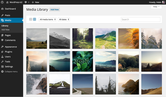
- Enhanced grid and details views for the media library
- Improved media embedding in posts (YouTube, Twitter, etc.)
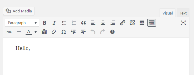
- Improvements to the post editor, including a toolbar that moves down the page as you type
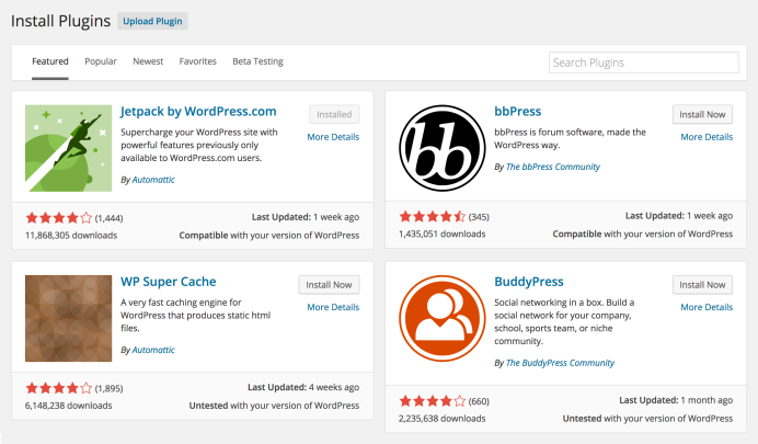
- An improved plugin search with much more visually appealing search results
If you look at the main feature list above, you will notice that all of them are improvements or enhancements for existing (already working) features. This caused a lot of people to decry v4.0 as a release that is not worthy of the apparent milestone that it represents (more on that below), but what a lot of people don’t realise is that these enhancements serve to refine WordPress to be an even greater platform for creating and publishing your work.
As for what’s new, we see more bug fixes, and patches and refinement of the underlying codebase. This was a focus of the 4.0 release, and getting WordPress leaner and faster remains a priority for the team.
Twenty Fifteen Officially Added to The Development Version of WordPress
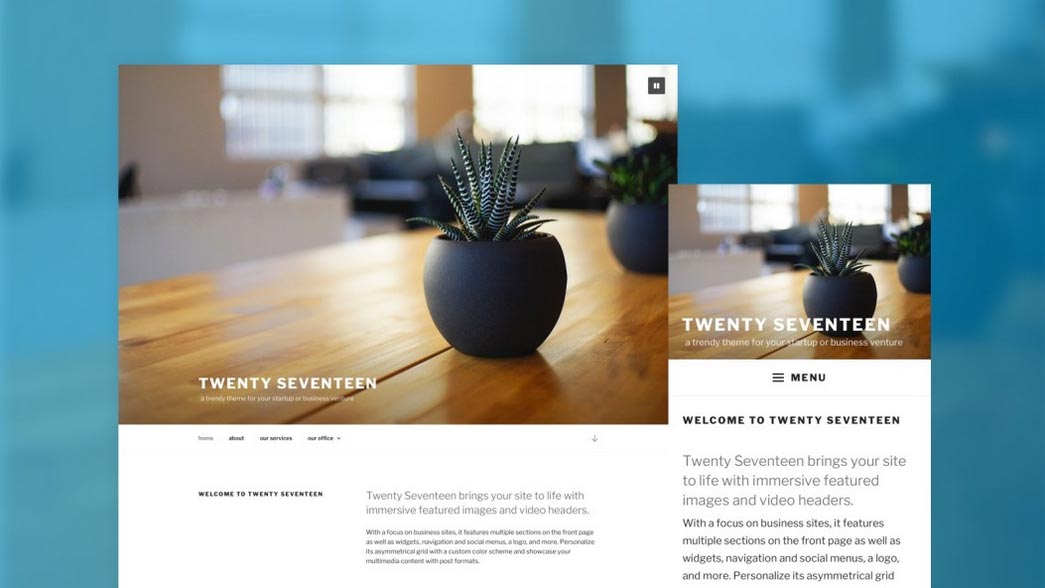
The default theme slated to ship with WordPress 4.1 dubbed “Twenty Fifteen” has officially been added to the development version of WordPress. In sharp contrast to Twenty Fourteen, Twenty Fifteen is a simple, two column, blog focused theme. The typography features Google’s Noto Serif and Sans, a font family designed to be visually harmonious across many of the worlds languages. Here’s what the Tavern looks like with Twenty Fifteen activated. In the screenshot, you’ll notice a scrollbar between the sidebar and content. Being able to scroll the sidebar separate from the content reminds me of the Visual Editor in WordPress 3.9. I’d like to see both columns be a cohesive unit for a better experience and to eliminate the ugly scrollbar.
There is a long way to go before Twenty Fifteen is ready for prime time. Initial feedback I’ve seen so far labels Twenty Fifteen as a breath of fresh air. Twenty Fifteen goes back to the blogging roots of WordPress, but it does so in a modern, elegant way. Once the bugs have been squashed and the theme polished, I think a lot of people will either switch to or use Twenty Fifteen when WordPress 4.1 is released.




Leave A Comment
You must be logged in to post a comment.